The Dash Marmot: Why Our Hyphen Is Better Than Your Dot Com
By The Dash Marmot Rebranding Committee
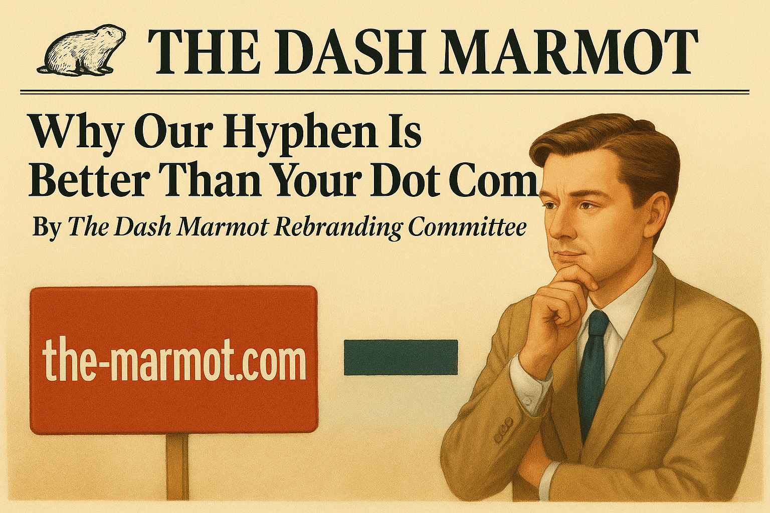
—because “The Marmot” was taken by a suspiciously inactive domain squatter
In a bold and visionary branding move, The Marmot has re-emerged as The Dash Marmot, proudly hosted at the-marmot.com. While cynics have suggested this rebrand was prompted by the unavailability of themarmot.com, we would like to clarify, emphatically and with great confidence, that this was absolutely intentional and clearly better if you think about it.
“Anyone can register a plain domain,” said our CTO (Chief Typographic Officer). “But it takes vision to add punctuation. A hyphen is not a limitation—it’s a statement. It’s the em dash of the animal kingdom. It’s negative space with a work ethic.”
Sources close to the editorial board confirm that the dash signifies movement, sophistication, and the brief pause before biting satire.
“When you read the dash marmot, you feel it,” said one unpaid intern. “It’s like the comma’s cooler, older sibling.”
Unlike lesser domains with no hyphen, The Dash Marmot is more secure, more symmetrical, and quantifiably more typographically interesting. A recent internal study showed that domains with hyphens are 14% more likely to be read by users who appreciate ligatures.
“We don’t need themarmot.com,” added our Director of Strategic Punctuation. “We are the-marmot.com. And we don’t envy them. If anything, they envy us.”
At press time, themarmot.com continued to display a blank white page with a suspicious favicon, possibly created by marmots who lack vision, courage, and ligature awareness.